As the first step in tidying my life, I revamp the maps in my undergraduate thesis using ggplot.
I admit I am a reluctant ggplot2 user. I feel like I don’t have control over small details, and I’m constantly Googling to change something small. However, I recognize the benefits of ggplot deep down and know that if I just get used to the syntax, I’ll slowly break away from reliance on Google. But, I’m currently still in Googling mode, so throughout this post, when I have to make adjustments to the basic ggplot, I include the phrases I Google as well as the link to the help I end up using.
In my undergraudate thesis I predicted amounts of trace uranium in the sediment across the continental United States using various geostatistical methods. Look here for a brief overview. My thesis contained many, many maps, but I made them in a really gross way using base plot.
There are two main types of plots in my thesis:
- Maps with color coded dots (usually plotting residuals).
- Interpolated heat maps over an actual map (usually plotting predicted surfaces).
In this post I’ll focus on #1. The one time I actively choose to use ggplot2 is when I need to color-code by a particular variable. This requires a few extra steps in base plot, so ggplot is actually quicker for me. When I looked back at my thesis code (B.G. – before ggplot) to refresh my memory for this post, I couldn’t believe how many lines of code were needed to make this type of plot. I posted an example of my original code, so that we can all appreciate how much ggplot streamlines things (this is probably not the most efficient base code either).

I will follow up with #2 in another post (I expect this one to be more challenging, so I want to build up to it).
The data I used in my thesis is curated from various USGS datasets. Unfortunately, my undergraduate thesis came before my knowledge of GitHub, so I cannot easily point to the preprocessing and analysis code online. However, if you are reading this and want to know more, I will endeavor to get all of the relevant code up on GitHub for you. This is on my long-term to-list, but I’ll make it a priority if someone would find it useful.
Let’s just see what a simple ggplot looks like, color coded by the amount of uranium.
require(ggplot2)
setwd("~/Smith/Senior Year/Stoudt_Thesis/FINAL_CODE/minDataForThesis")
us <- read.csv("usToUseNoDuplicates.csv")
ggplot(us, aes(x = long, y = lat, col = uranium)) +
  geom_point()
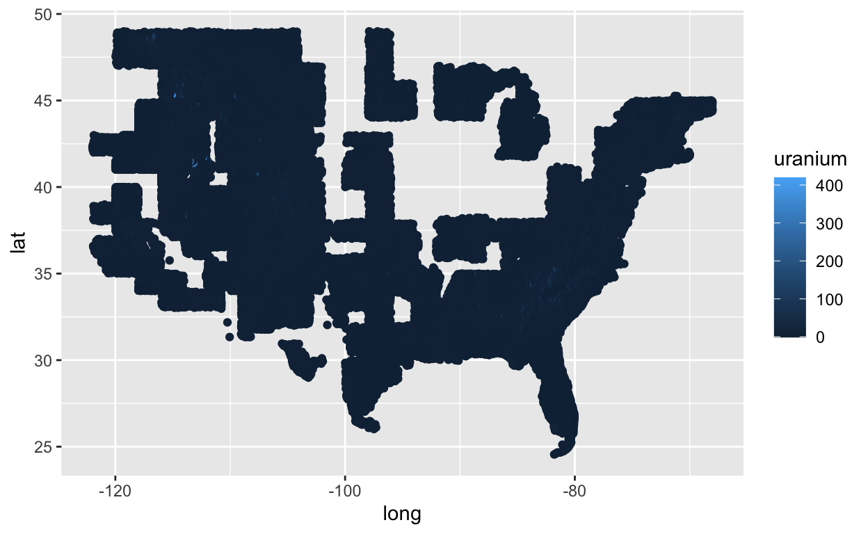
My first major problem with this plot is the default blue scale. I really can’t tell the difference between various blues even with data less skewed than this. Let’s try the Color Brewer palette that I used in my thesis.
Google “color by value ggplot2”
require(RColorBrewer)
# http://www.sthda.com/english/wiki/ggplot2-colors-how-to-change-colors-automatically-and-manually
ggplot(us, aes(x = long, y = lat, col = uranium)) +
  geom_point() +
  scale_color_gradientn(colours = c(brewer.pal(9, "YlOrRd"), "black"))
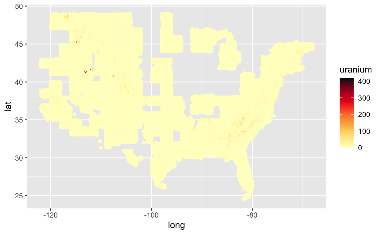
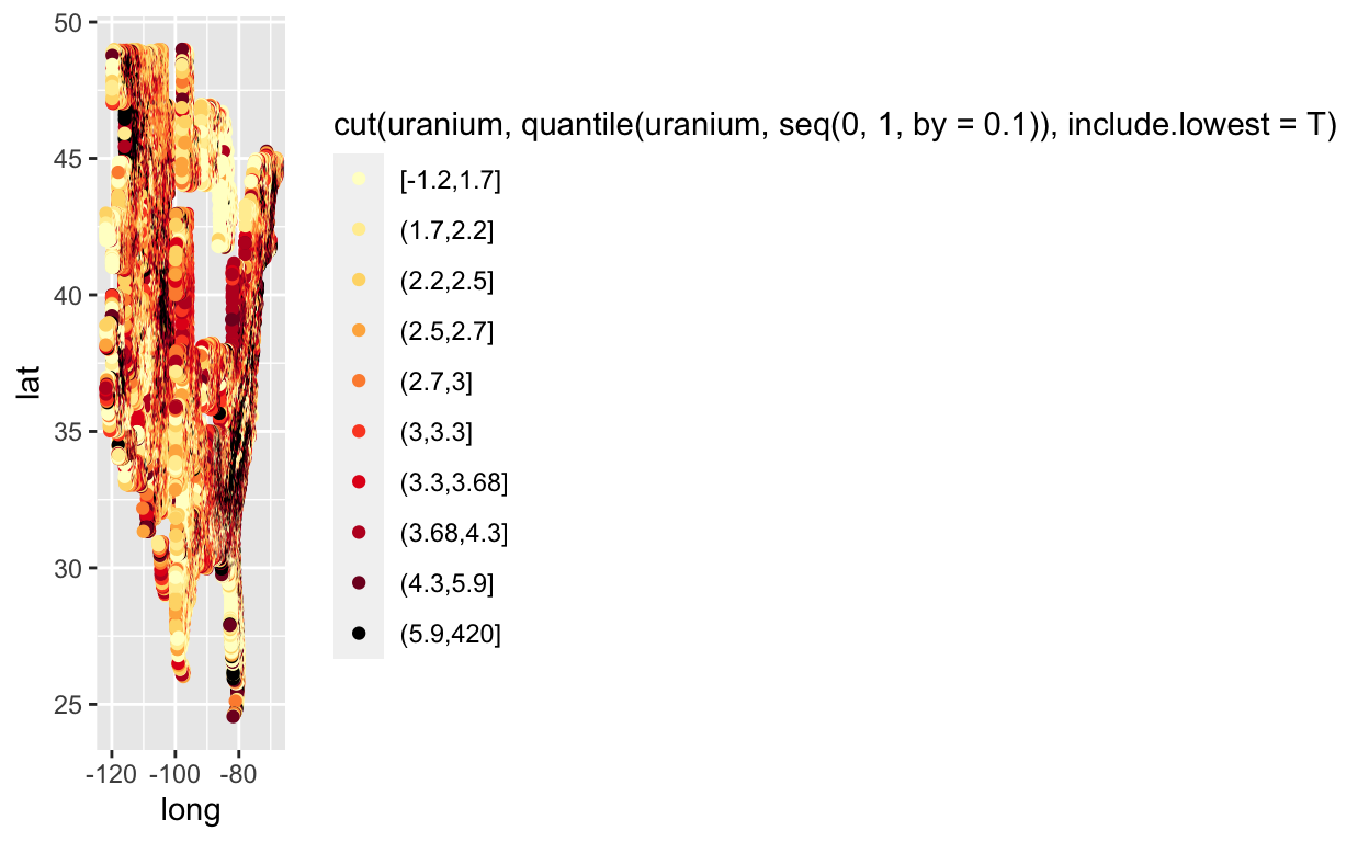
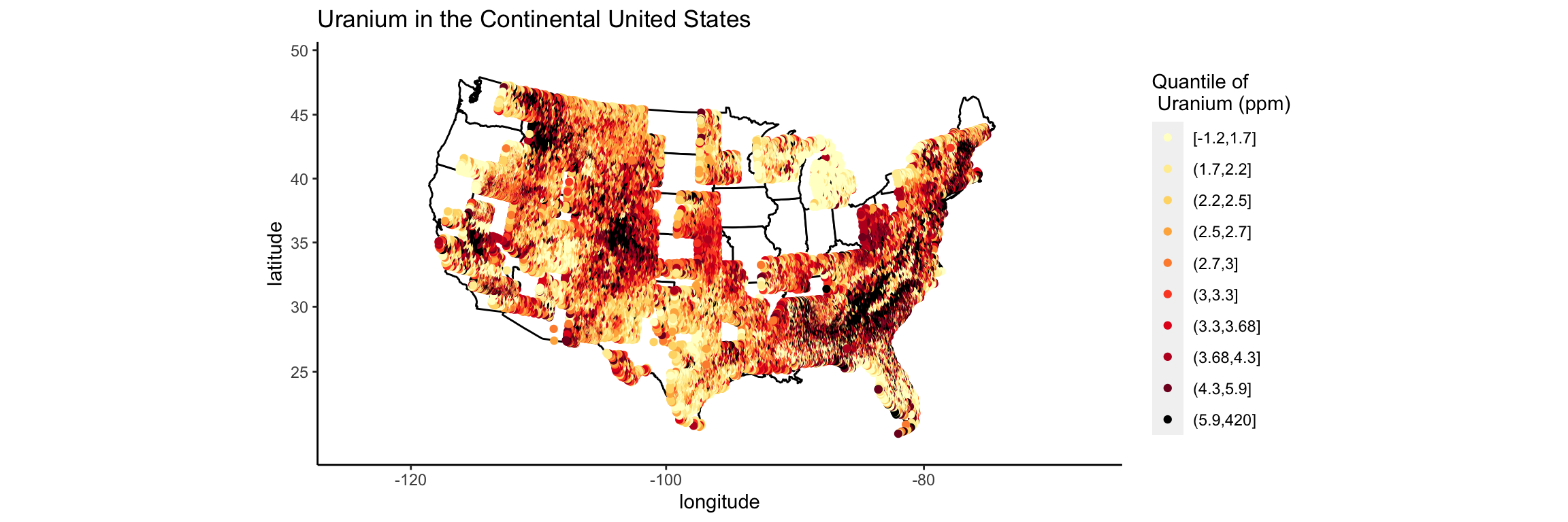
We still have issues with extreme skew in the uranium values. Most are trace values, but there are some locations that are near old uranium mines that have very large values of uranium. In my thesis I color coded by percentiles. Let’s try that.
Google “color by percentile ggplot 2”
# https://stackoverflow.com/questions/18473382/color-code-points-based-on-percentile-in-ggplot
ggplot(us, aes(x = long, y = lat, col = cut(uranium, quantile(uranium, seq(0, 1, by = .1)), include.lowest = T))) +
  geom_point() +
  scale_colour_manual(values = c(brewer.pal(9, "YlOrRd"), "black"))
Now I want the actual map of the United States to be underneath these points.
Google “add outline of us map ggplot”
While we’re at it, let’s make the name of the legend less gross, so the map isn’t squished.
Google “name of legend ggplot2”
require(maps)
all_states <- map_data("state")
p <- ggplot() +
  geom_polygon(data = all_states, aes(x = long, y = lat, group = group), colour = "black", fill = "white")
# https://uchicagoconsulting.wordpress.com/tag/r-ggplot2-maps-visualization/
# http://www.cookbook-r.com/Graphs/Legends_(ggplot2)/
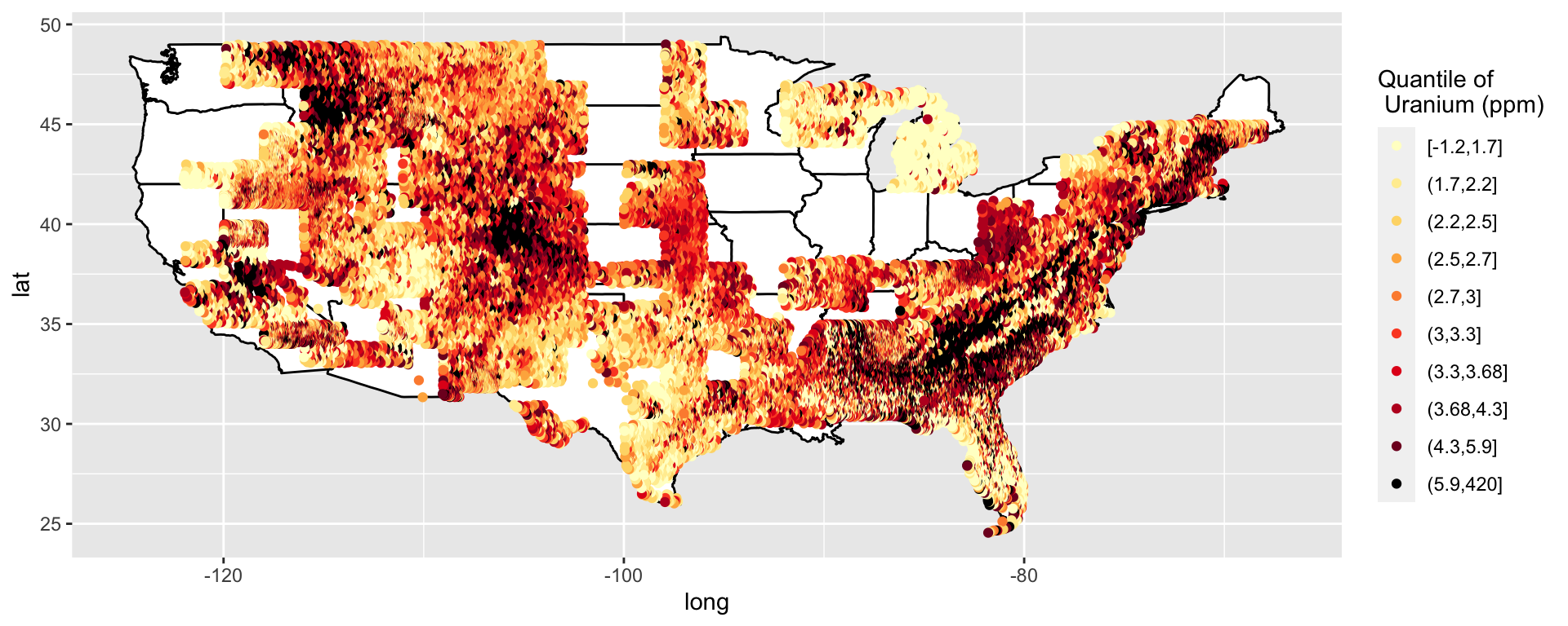
p <- p + geom_point(data = us, aes(x = long, y = lat, col = cut(uranium, quantile(uranium, seq(0, 1, by = .1))))) + geom_point() + scale_colour_manual(name = "Quantile of \n Uranium (ppm)", values = c(brewer.pal(9, "YlOrRd"), "black"))
p
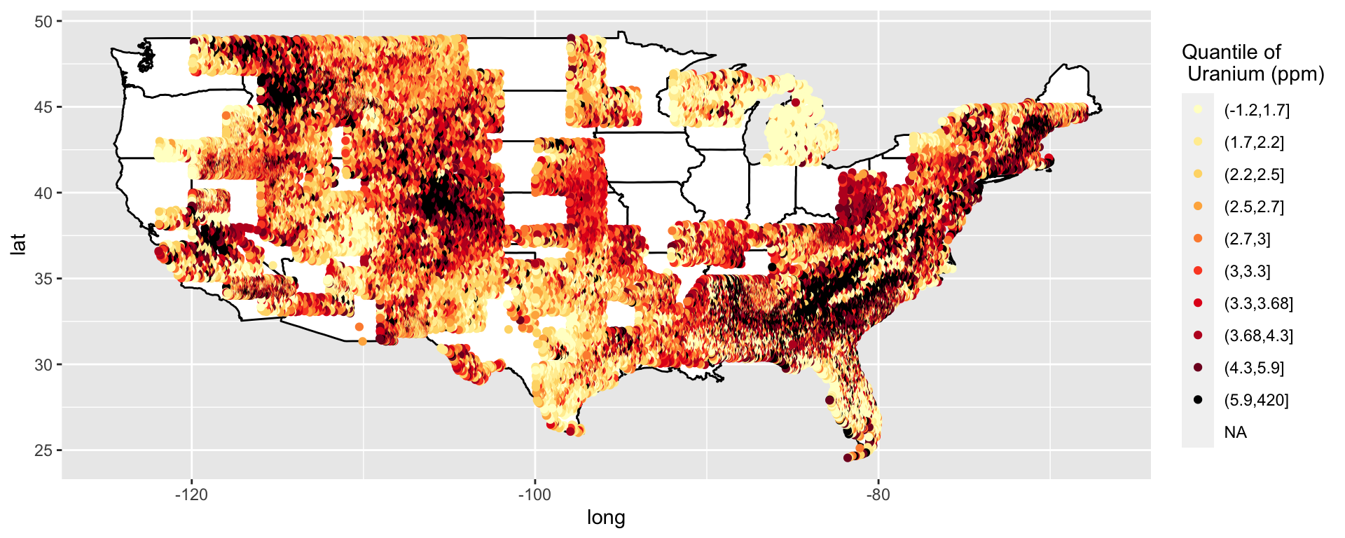
This data is supposed to be clean. What is that one annoying missing value?
Oh, cut doesn’t include the minimum. That is kind of annoying.
Google “cut to include minimum R”
Yay, I can just specify that I want the minimum included. That was a quick fix.
# https://stackoverflow.com/questions/12245149/cut-include-lowest-values

p <- ggplot() +
  geom_polygon(data = all_states, aes(x = long, y = lat, group = group), colour = "black", fill = "white")
p <- p + geom_point(data = us, aes(x = long, y = lat, col = cut(uranium, quantile(uranium, seq(0, 1, by = .1)), include.lowest = T))) + geom_point() + scale_colour_manual(name = "Quantile of \n Uranium (ppm)", values = c(brewer.pal(9, "YlOrRd"), "black"))
p
So far I have just been using latitude and longitude, but in my thesis I projected my data to avoid distortion.
Google “projected maps ggplot2”
# https://ggplot2.tidyverse.org/reference/coord_map.html
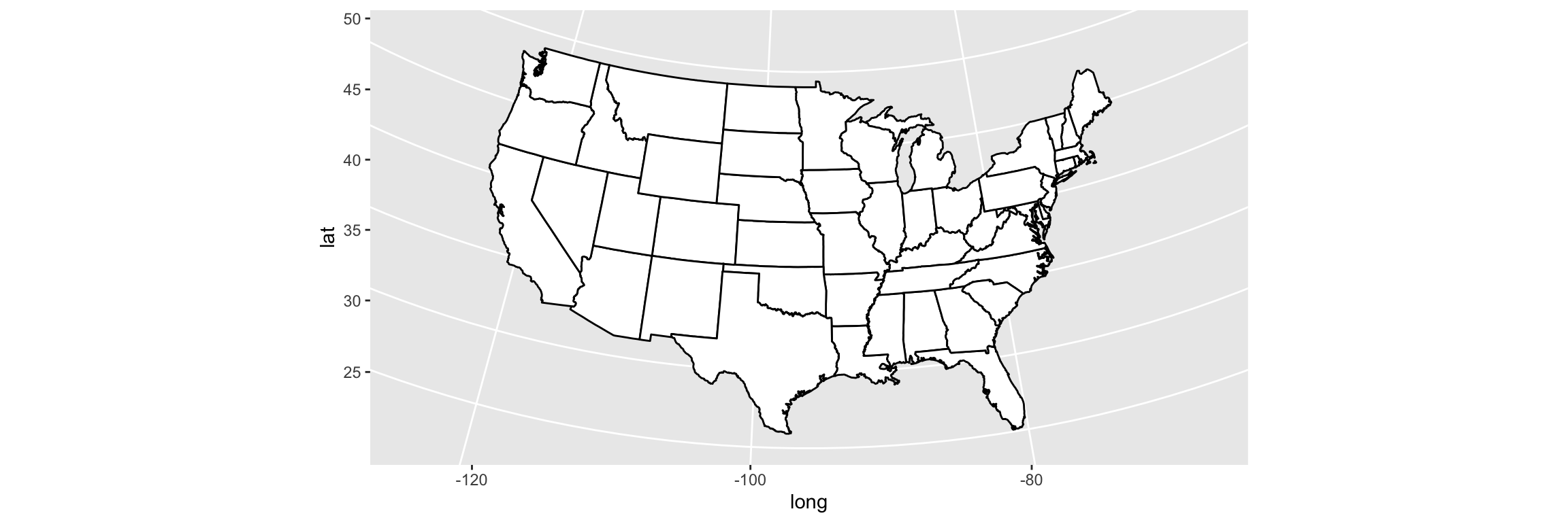
p <- ggplot() +
geom_polygon(data = all_states, aes(x = long, y = lat, group = group), colour = "black", fill = "white") +
coord_map("lambert", parameters = c(c(33, 45)))
p
p <- p + geom_point(data = us, aes(x = long, y = lat, col = cut(uranium, quantile(uranium, seq(0, 1, by = .1)), include.lowest = T))) + geom_point() + scale_colour_manual(name = "Quantile of \n Uranium (ppm)", values = c(brewer.pal(9, "YlOrRd"), "black"))
p
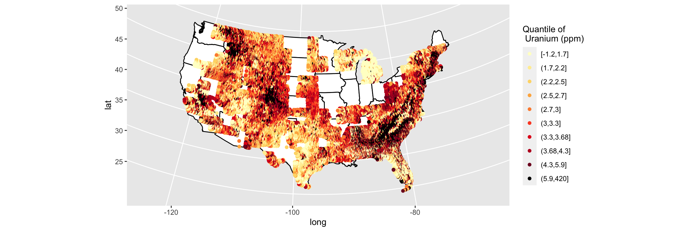
That was actually easier than I anticipated. Now all that is left is to clean up the labels and the background.
Google “plain background ggplot”
# http://felixfan.github.io/ggplot2-remove-grid-background-margin/
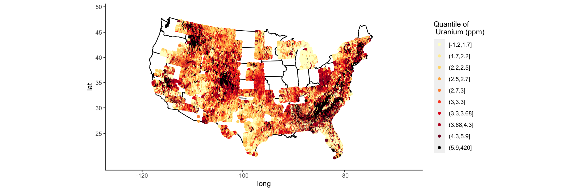
p <- p + theme(
panel.grid.major = element_blank(), panel.grid.minor = element_blank(),
panel.background = element_blank(), axis.line = element_line(colour = "black")
)
p
I actually have the syntax for axis labels memorized (yay!).
Since I made many versions of this type of plot in my thesis, if I could go back in time, I would make a function to create these types of plots (by passing in the column name to color by), or at least a theme, to minimize the amount of typing/copy-paste.
Creating themes may actually help me use ggplot more readily. If I have standard themes for types of plots I make regularly, I won’t have to get out of the zone to re-Google how to change pieces of the plot. I also might try to use qplot when I’m in the exploratory stage and want to make quick plots. Then I can move to ggplot for more formal plots.
Stay tuned for my attempt at an interpolated heat map over an actual map in ggplot…
Feedback, questions, comments, etc. are welcome (@sastoudt).
Special thanks to @BaumerBen and @askdrstats for helping me with my undergraduate thesis and for bearing with me through the gross code and many, many maps.
Thank you to @dpseidel for reading through this to make sure I was making sense.
Suggestions from Twitter
I’d recommend looking j to viridis scale and using ggplot2::cut_number()
— Hadley Wickham (@hadleywickham) April 24, 2018
try using theme_void() to get rid of the unneeded axes
— Steve Haroz (@sharoz) April 24, 2018
Let’s try these tips out!
require(viridis)
p <- ggplot() +
  geom_polygon(data = all_states, aes(x = long, y = lat, group = group), colour = "black", fill = "white") +
  coord_map("lambert", parameters = c(c(33, 45)))

p <- p + geom_point(data = us, aes(x = long, y = lat, col = cut_number(uranium, 10))) + geom_point() +
  scale_color_viridis(discrete = TRUE, option = "inferno", name = "Quantile of \n Uranium (ppm)")
# scale_colour_manual(name="Quantile of \n Uranium (ppm)",values=c(brewer.pal(9, "YlOrRd"),"black"))
p + theme_void()
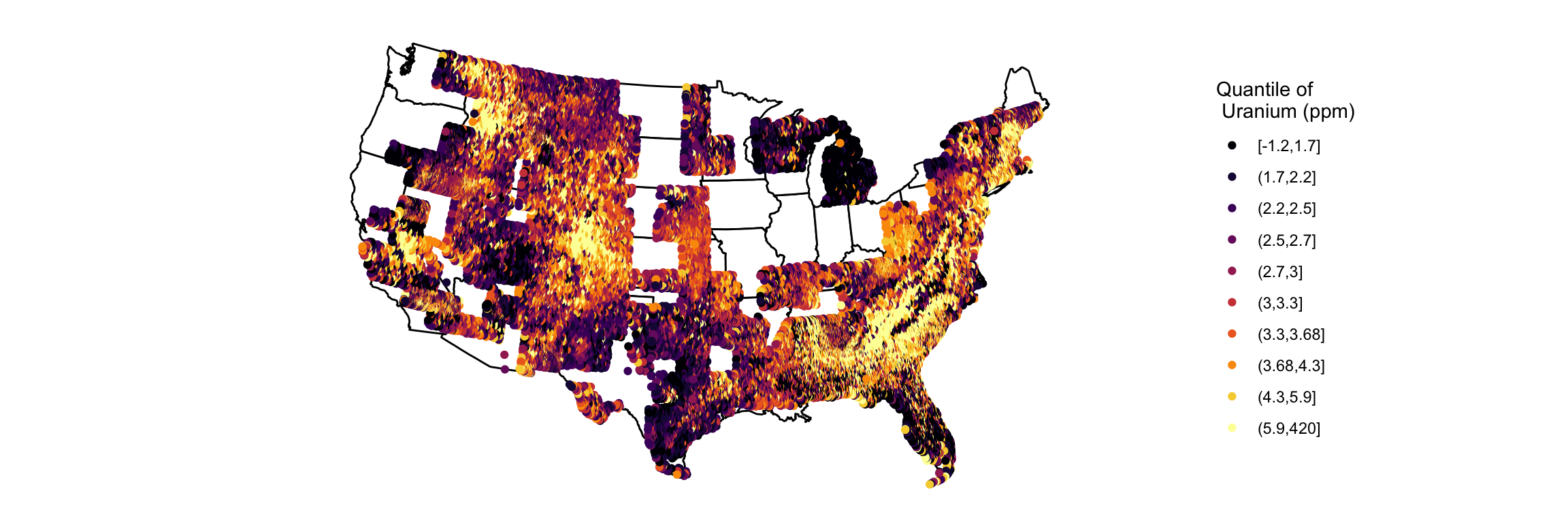
Using cut_number instead of quantile means that each color bin has roughly the same number of points in it. We can see that the bins containing the smallest and largest values have a wide range to ensure that they have the same number of points as more dense, yet narrower ranges. This makes the majority of points have better color contrast, but it hides outliers.
I thought Color Brewer was a reasonable color palette, but wanted to know why viridis might be preferred. Through some Googling: This says that Color Brewer palettes are “accurate in lightness and hue, but not in saturation” while this says that viridis palettes are “perceptually uniform (i.e. changes in the data should be accurately decoded by our brains) even when desaturated”.