Forever ago @dpseidel drew my attention to an awesome dataset collected by @jimwebb about tweets that cursed being cold/hot. This reminded me of a project that @danascientist (so many Dana’s!) and I did in @BaumerBen’s class where we tried to assess how cold it had to be for people to talk about being cold on Twitter. I was curious whether differences in region would impact the overall median per phrase since we expect those in warmer regions to have less of a tolerance to the cold.
This seemed like a perfect dataset to work through the forcats package and tackle some factors. Be warned, curse words are involved.
First I translate lat/long to state.
# https://stackoverflow.com/questions/8751497/latitude-longitude-coordinates-to-state-code-in-r
latlong2state <- function(pointsDF) {
  # Prepare SpatialPolygons object with one SpatialPolygon
  # per state (plus DC, minus HI & AK)
  states <- map("state", fill = TRUE, col = "transparent", plot = FALSE)
  IDs <- sapply(strsplit(states$names, ":"), function(x) x[1])
  states_sp <- map2SpatialPolygons(states,
    IDs = IDs,
    proj4string = CRS("+proj=longlat +datum=WGS84")
  )

  # Convert pointsDF to a SpatialPoints object
  pointsSP <- SpatialPoints(pointsDF,
    proj4string = CRS("+proj=longlat +datum=WGS84")
  )

  # Use 'over' to get _indices_ of the Polygons object containing each point
  indices <- over(pointsSP, states_sp)

  # Return the state names of the Polygons object containing each point
  stateNames <- sapply(states_sp@polygons, function(x) x@ID)
  stateNames[indices]
}

data$state <- latlong2state(data[, c("long", "lat")])
Then I break down the states into regions using fct_collapse since we don’t have enough tweets per state.
data$division <- fct_collapse(data$state,
  newengland = c("connecticut", "maine", "massachusetts", "new hampshire", "rhode island", "vermont"),
  midatlantic = c("new jersey", "new york", "pennsylvania"),
  eastnorthcentral = c("illinois", "indiana", "michigan", "ohio", "wisconsin"),
  westnorthcentral = c("iowa", "kansas", "minnesota", "missouri", "nebraska", "north dakota", "south dakota"),
  southatlantic = c("delaware", "florida", "georgia", "maryland", "north carolina", "south carolina", "district of columbia", "west virginia", "virginia"),
  eastsouthcentral = c("alabama", "kentucky", "mississippi", "tennessee"),
  westsouthcentral = c("arkansas", "louisiana", "oklahoma", "texas"),
  mountain = c("arizona", "colorado", "idaho", "montana", "nevada", "new mexico", "utah", "wyoming"),
  pacific = c("alaska", "california", "hawaii", "oregon", "washington")
)

data$region <- fct_collapse(data$division,
  northeast = c("newengland", "midatlantic"),
  midwest = c("eastnorthcentral", "westnorthcentral"),
  south = c("southatlantic", "eastsouthcentral", "westsouthcentral"),
  west = c("mountain", "pacific")
)
No Hawaii or Alaska in our dataset, but that’s fine. Also, am I the only one who thinks it is weird that Delaware is considered the south?
We can use fct_count to easily count how many tweets fall in each category.
fct_count(data$division)
# A tibble: 10 x 2
   f                    n
   <fct>            <int>
 1 eastsouthcentral   313
 2 mountain           224
 3 westsouthcentral   709
 4 pacific            911
 5 newengland         108
 6 southatlantic     1043
 7 eastnorthcentral   697
 8 westnorthcentral   172
 9 midatlantic        500
10 <NA> 698fct_count(data$region)
# A tibble: 5 x 2
  f             n
  <fct>     <int>
1 south      2065
2 west       1135
3 northeast   608
4 midwest     869
5 <NA>        698
Even these are a bit sparse, so we’ll stick with region to try to get a reasonable number of tweets per phrase.
For reference I want to easily be able to tell which phrase contains “hot” or “cold”.
Now I want to pick the phrases that are displayed in Jim’s plots to make comparisons easier.
toCompare <- c("colder than mars", "colder than a witch's tit", "cold as heck", "colder than a mf", "cold as a bitch", "cold as balls", "cold as tits", "cold as fuck", "colder than my heart", "colder than a bitch", "cold as a mf", "cold as hell", "cold as ice", "hot as heck", "hotter than two rats", "hot as balls", "hotter than hell", "hot as tits", "hot as hell", "hot as fuck", "hot as shit", "hotter than satan's asshole", "hot as a mf", "hot as a bitch", "hotter than a mf", "hot as hades", "hot as dick")
We can use fct_other to lump all the other phrases into an “Other” category.
data$phrase <- fct_other(data$phrase, keep = toCompare)
Some regions don’t have every phrase, but I want that to be explicit in the data, so we break out our new friend tidyr. You can read more about my adventures with tidyr here.
data <- left_join(expand(data, phrase, region), data, c("phrase" = "phrase", "region" = "region"))

res <- data %>%
  group_by(phrase, region) %>%
  summarise(medAppT = median(apparentTemperature, na.rm = T), count = n())

data %>%
  group_by(phrase) %>%
  summarise(medAppT = median(apparentTemperature, na.rm = T), count = n()) %>%
  arrange(medAppT)
# A tibble: 28 x 3
   phrase                    medAppT count
   <fct>                       <dbl> <int>
 1 colder than mars             13.4     8
 2 colder than a witch's tit    24.0    28
 3 cold as heck                 24.8    35
 4 colder than a mf             33.2    15
 5 cold as balls                35.4    62
 6 cold as a bitch              37.6    41
 7 cold as fuck                 40.3   545
 8 cold as tits                 41.4    23
 9 cold as a mf                 43.1    23
10 colder than my heart         43.2    16
# … with 18 more rows
Success! We match Jim’s values. I can try to make a quick plot to assess differences per region.
res2 <- subset(res, !is.na(region) & phrase != "Other")
ggplot(data = res2, aes(x = phrase, y = medAppT, col = region)) +
  geom_point() +
  theme(axis.text.x = element_text(angle = 45, hjust = 1))
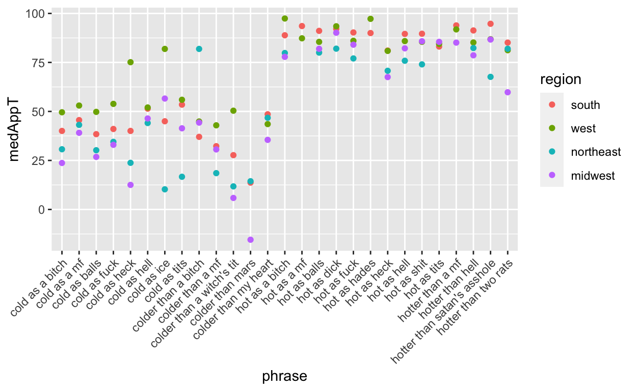
But my ordering doesn’t match Jim’s so it’s hard to compare. He ordered them by overall median, so I can compute that and then use fct_reorder to rearrange. But first I need to get rid of the pesky “Other” category using fct_drop.
data2 <- data %>% filter(phrase != "Other")
data2$phrase <- fct_drop(data2$phrase) ## defaults to drop what isn't present

toOrder <- data2 %>%
  group_by(phrase) %>%
  summarise(medAppT = median(apparentTemperature, na.rm = T), count = n()) %>%
  arrange(medAppT) %>%
  mutate(order = 1:nrow(.))

res2$phrase <- fct_drop(res2$phrase) ## drop before merging so levels match

res2 <- left_join(x = res2, y = toOrder, by = c("phrase" = "phrase"))

res2$phrase <- fct_reorder(res2$phrase, res2$order)

ggplot(data = res2, aes(x = phrase, y = medAppT.x, col = region)) +
  geom_point() +
  theme(axis.text.x = element_text(angle = 45, hjust = 1)) +
  ylab("median apparent temp (F)") +
  xlab("")
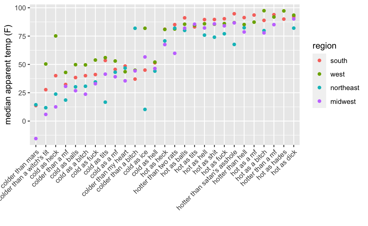
There we go! But it is still hard to see what is going on. The south and west have larger temperatures for cold and hot categories which makes sense. But how much do the differences in number of tweets by region affect the median? Regional differences in phrase usage could potentially skew even a median.
## drop levels
data2 <- data %>% filter(phrase != "Other")
data2$phrase <- fct_drop(data2$phrase, only = "Other")
## I would like to be able to do this in one step?

## reorder
data2 <- left_join(x = data2, y = toOrder, by = c("phrase" = "phrase"))
data2$phrase <- fct_reorder(data2$phrase, data2$order)

## add on medians in black
ggplot(data = filter(data2, !is.na(region)), aes(x = phrase, y = apparentTemperature, col = region)) +
  geom_point(alpha = .5) +
  geom_point(aes(x = phrase, y = medAppT), cex = 2, col = "black") +
  theme(axis.text.x = element_text(angle = 45, hjust = 1)) +
  xlab("") +
  ylab("apparent temperature (F)")
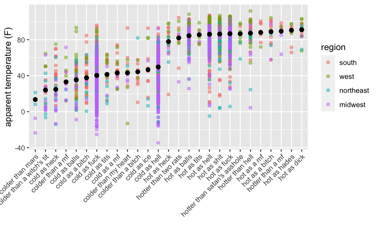
Even with some transparency in the points, we can’t see what may be affecting the medians (shown in black). Jittering on the categorical scale to the rescue!
ggplot(data = filter(data2, !is.na(region)), aes(x = phrase, y = apparentTemperature, col = region)) +
  geom_point(alpha = .5, position = position_jitter(w = .25, h = 0)) +
  geom_point(aes(x = phrase, y = medAppT), cex = 2, col = "black") +
  theme(text = element_text(size = 15), axis.text.x = element_text(angle = 45, hjust = 1)) +
  xlab("") +
  ylab("apparent temperature (F)")
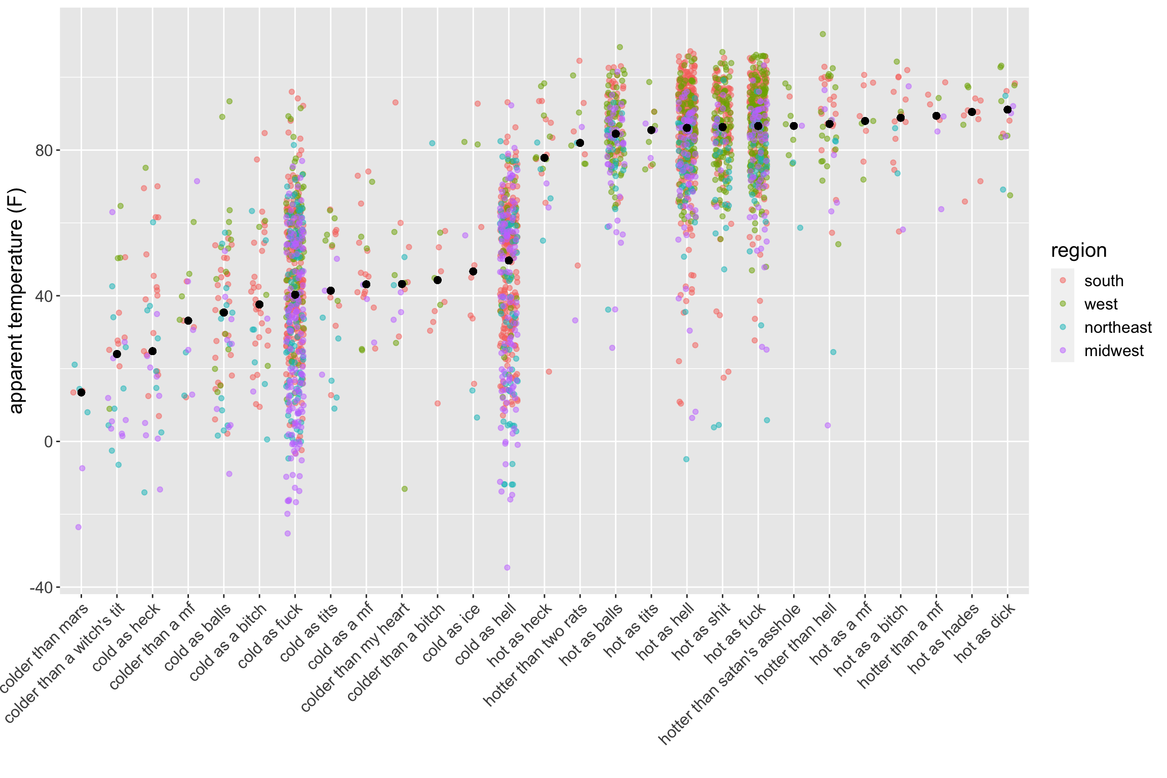
There are no immediately obvious clusters by region in the temperature direction per phrase, so the median seems like a reasonable choice. However, we can see how the mean could be affected by values that differ from the majority per phrase.
Actually drawing conclusions is beyond the scope of this post but questions remain:
Do particular regions use certain phrases more than we would expect by proportion of people/Twitter users?
Within phrases that are common across all regions, are there statistically and practically significant differences between the average temperature when a phrase is used?
I almost made it through this post without a gif (the horror!).

Feedback, questions, comments, etc. are welcome (@sastoudt).
P.S. @AmeliaMN and @askdrstats have a great paper about Wrangling Categorical Data in R if you want some serious guidance on factors.