Week 7 - Star Wars Survey (2014)
RAW DATA
Article
DataSource fivethirtyeight (fivethirtyeight package)
How do perceptions of female Star Wars characters differ across age and gender?
Brute force manipulation.
Let’s focus on those who have actually seen Star Wars.
swYes <- subset(sw, seenStarWars == "Yes")
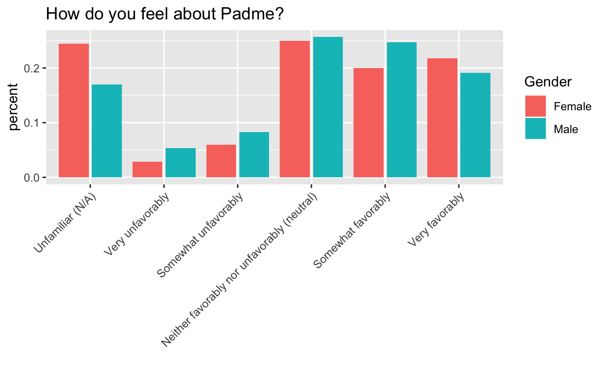
Padme
## complete data only
toPlot <- swYes[-which(swYes$Gender == ""), c("V28", "Gender", "Age")]
toPlot <- toPlot[-which(toPlot$V28 == ""), ]

toPlot$V28 <- factor(toPlot$V28)
toPlot$V28 <- factor(toPlot$V28, levels = levels(toPlot$V28)[c(4, 6, 3, 1, 2, 5)]) ## GROSS!

byCatGen <- toPlot %>%
  group_by(V28, Gender) %>%
  summarise(count = n())

byGen <- toPlot %>%
  group_by(Gender) %>%
  summarise(count = n())

toPlot <- byCatGen %>%
  inner_join(byGen, by = c("Gender" = "Gender")) %>%
  mutate(percent = count.x / count.y)
ggplot(toPlot, aes(V28, y = percent, fill = Gender)) +
  geom_bar(stat = "identity", position = position_dodge2(preserve = "total")) +
  theme(axis.text.x = element_text(angle = 45, hjust = 1)) +
  xlab("") +
  ggtitle("How do you feel about Padme?")
## complete data only
toPlot <- swYes[, c("V28", "Gender", "Age")]
toPlot <- swYes[-which(swYes$Gender == ""), c("V28", "Gender", "Age")]
toPlot <- toPlot[-which(toPlot$V28 == ""), ]

## relevel
toPlot$V28 <- factor(toPlot$V28)
levels(toPlot$V28)
[1] "Neither favorably nor unfavorably (neutral)"
[2] "Somewhat favorably"
[3] "Somewhat unfavorably"
[4] "Unfamiliar (N/A)"
[5] "Very favorably"
[6] "Very unfavorably" toPlot$V28 <- factor(toPlot$V28, levels = levels(toPlot$V28)[c(4, 6, 3, 1, 2, 5)]) ## GROSS!
byCatGenAge <- toPlot %>%
group_by(Gender, Age, V28) %>%
summarise(count = n())
byGenAge <- toPlot %>%
group_by(Gender, Age) %>%
summarise(count = n())
toPlot <- byCatGenAge %>%
inner_join(byGenAge, by = c("Gender" = "Gender", "Age" = "Age")) %>%
mutate(percent = count.x / count.y)
## get combo
toPlot$genderAge <- paste(toPlot$Gender, toPlot$Age) ## is there a less hacky way to do this?
toPlot$genderAge <- as.factor(toPlot$genderAge)
## relevel
levels(toPlot$genderAge)
[1] "Female > 60"  "Female 18-29" "Female 30-44" "Female 45-60"
[5] "Male > 60" "Male 18-29" "Male 30-44" "Male 45-60" Thanks for the help!!
From @ibddoctor: https://t.co/193sOToMJB
levels(toPlot$genderAge)
[1] "Female 18-29" "Male 18-29"   "Female 30-44" "Male 30-44"
[5] "Female 45-60" "Male 45-60" "Female > 60" "Male > 60" ggplot(toPlot, aes(V28, y = percent, fill = genderAge, order = genderAge)) +
geom_bar(stat = "identity", position = position_dodge2(preserve = "total")) +
theme(axis.text.x = element_text(angle = 45, hjust = 1)) +
xlab("") +
ggtitle("How do you feel about Padme?") +
scale_fill_manual("legend", values = c("Female 18-29" = "indianred", "Male 18-29" = "red", "Female 30-44" = "dodgerblue", "Male 30-44" = "blue", "Female 45-60" = "green", "Male 45-60" = "forestgreen", "Female > 60" = "grey", "Male > 60" = "black"))

## NOPE, but this would be ideal
From @hadleywickham: try arrange()ing
toPlot$Gender <- as.factor(toPlot$Gender)
toPlot$Age <- as.factor(toPlot$Age)


levels(toPlot$genderAge) ## fine
[1] "Female 18-29" "Male 18-29"   "Female 30-44" "Male 30-44"
[5] "Female 45-60" "Male 45-60" "Female > 60" "Male > 60" levels(toPlot$Age) ## need to relevel
[1] "> 60" "18-29" "30-44" "45-60"toPlot$Age <- factor(toPlot$Age, levels = levels(toPlot$Age)[c(2, 3, 4, 1)]) ## GROSS!
# toPlot$genderAge=factor(toPlot$genderAge,levels=levels(toPlot$genderAge)[c(2,6,3,7,4,8,1,5)]) ## GROSS!
## if it plots one level of V28 at a time, this would make sense
test <- toPlot %>% arrange(Age, V28)
head(test)
# A tibble: 6 x 7
# Groups:   Gender, Age [2]
  Gender Age   V28                 count.x count.y percent genderAge
  <fct>  <fct> <fct>                 <int>   <int>   <dbl> <fct>
1 Female 18-29 Unfamiliar (N/A)         10      85  0.118  Female 18-…
2 Male   18-29 Unfamiliar (N/A)          5      93  0.0538 Male 18-29
3 Female 18-29 Very unfavorably          3      85  0.0353 Female 18-…
4 Male   18-29 Very unfavorably          8      93  0.0860 Male 18-29
5 Female 18-29 Somewhat unfavorab…       6      85  0.0706 Female 18-…
6 Male 18-29 Somewhat unfavorab… 12 93 0.129 Male 18-29 ggplot(test, aes(V28, y = percent, fill = genderAge)) +
geom_bar(stat = "identity", position = position_dodge2(preserve = "total")) +
theme(axis.text.x = element_text(angle = 45, hjust = 1)) +
xlab("") +
ggtitle("How do you feel about Padme?") +
scale_fill_manual("legend", values = c("Female 18-29" = "indianred", "Male 18-29" = "red", "Female 30-44" = "dodgerblue", "Male 30-44" = "blue", "Female 45-60" = "green", "Male 45-60" = "forestgreen", "Female > 60" = "grey", "Male > 60" = "black"))

## NOPE but closer, now all the females are together
THIS IS THE ONE

Members of the older female generation are not (proportionally) Padme fans.
test <- as.data.frame(toPlot %>% arrange(Age, V28))
head(test)
  Gender   Age                  V28 count.x count.y    percent
1 Female 18-29     Unfamiliar (N/A)      10      85 0.11764706
2   Male 18-29     Unfamiliar (N/A)       5      93 0.05376344
3 Female 18-29     Very unfavorably       3      85 0.03529412
4   Male 18-29     Very unfavorably       8      93 0.08602151
5 Female 18-29 Somewhat unfavorably       6      85 0.07058824
6   Male 18-29 Somewhat unfavorably      12      93 0.12903226
     genderAge
1 Female 18-29
2   Male 18-29
3 Female 18-29
4   Male 18-29
5 Female 18-29
6 Male 18-29ggplot(test, aes(V28, y = percent, fill = genderAge)) +
geom_bar(stat = "identity", position = position_dodge2(preserve = "total")) +
theme(axis.text.x = element_text(angle = 45, hjust = 1)) +
xlab("") +
ggtitle("How do you feel about Padme?") +
scale_fill_manual("legend", values = c("Female 18-29" = "indianred", "Male 18-29" = "red", "Female 30-44" = "dodgerblue", "Male 30-44" = "blue", "Female 45-60" = "green", "Male 45-60" = "forestgreen", "Female > 60" = "grey", "Male > 60" = "black"))
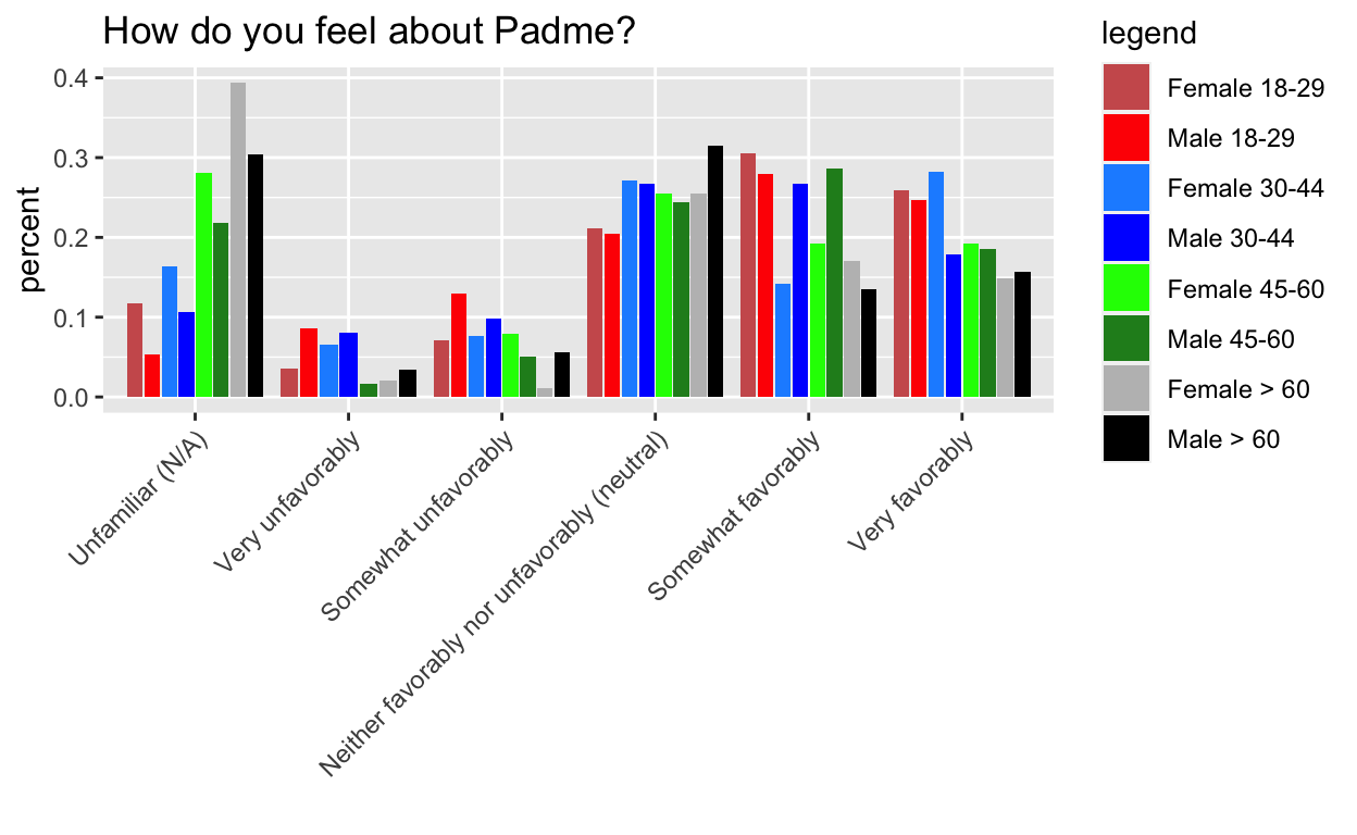
## MAGICALLY WORKS
Mystery: Why is as.data.frame needed?
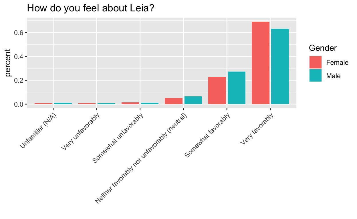
Leia
Everyone loves Leia.
## complete data only
toPlot <- swYes[-which(swYes$Gender == ""), c("V18", "Gender", "Age")]
toPlot <- toPlot[-which(toPlot$V18 == ""), ]

## relevel
toPlot$V18 <- factor(toPlot$V18)
toPlot$V18 <- factor(toPlot$V18, levels = levels(toPlot$V18)[c(4, 6, 3, 1, 2, 5)]) ## GROSS!

byCatGen <- toPlot %>%
  group_by(V18, Gender) %>%
  summarise(count = n())

byGen <- toPlot %>%
  group_by(Gender) %>%
  summarise(count = n())

toPlot <- byCatGen %>%
  inner_join(byGen, by = c("Gender" = "Gender")) %>%
  mutate(percent = count.x / count.y)
ggplot(toPlot, aes(V18, y = percent, fill = Gender)) +
  geom_bar(stat = "identity", position = position_dodge2(preserve = "total")) +
  theme(axis.text.x = element_text(angle = 45, hjust = 1)) +
  xlab("") +
  ggtitle("How do you feel about Leia?")
## complete data only
toPlot <- swYes[, c("V18", "Gender", "Age")]
toPlot <- swYes[-which(swYes$Gender == ""), c("V18", "Gender", "Age")]
toPlot <- toPlot[-which(toPlot$V18 == ""), ]

byCatGenAge <- toPlot %>%
  group_by(Gender, Age, V18) %>%
  summarise(count = n())

byGenAge <- toPlot %>%
  group_by(Gender, Age) %>%
  summarise(count = n())

toPlot <- byCatGenAge %>%
  inner_join(byGenAge, by = c("Gender" = "Gender", "Age" = "Age")) %>%
  mutate(percent = count.x / count.y)

## get combo
toPlot$genderAge <- paste(toPlot$Gender, toPlot$Age) ## is there a less hacky way to do this?
toPlot$genderAge <- as.factor(toPlot$genderAge)

## relevel
levels(toPlot$genderAge)
[1] "Female > 60"  "Female 18-29" "Female 30-44" "Female 45-60"
[5] "Male > 60" "Male 18-29" "Male 30-44" "Male 45-60" toPlot$genderAge <- factor(toPlot$genderAge, levels = levels(toPlot$genderAge)[c(2, 6, 3, 7, 4, 8, 1, 5)]) ## GROSS!
# toPlot$genderAge=ordered(toPlot$genderAge,levels=levels(toPlot$genderAge)[c(2,6,3,7,4,8,1,5)]) ## GROSS!
toPlot$V18 <- as.factor(toPlot$V18)
toPlot$V18 <- factor(toPlot$V18, levels = levels(toPlot$V18)[c(4, 6, 3, 1, 2, 5)]) ## GROSS!
What’s up with the female youths here?!
toPlot$Gender <- as.factor(toPlot$Gender)
toPlot$Age <- as.factor(toPlot$Age)


levels(toPlot$genderAge) ## fine
[1] "Female 18-29" "Male 18-29"   "Female 30-44" "Male 30-44"
[5] "Female 45-60" "Male 45-60" "Female > 60" "Male > 60" levels(toPlot$Age) ## need to relevel
[1] "> 60" "18-29" "30-44" "45-60"toPlot$Age <- factor(toPlot$Age, levels = levels(toPlot$Age)[c(2, 3, 4, 1)]) ## GROSS!
## if it plots one level of V18 at a time, this would make sense
test <- as.data.frame(toPlot %>% arrange(Age, V18))
ggplot(test, aes(V18, y = percent, fill = genderAge)) +
geom_bar(stat = "identity", position = position_dodge2(preserve = "total")) +
theme(axis.text.x = element_text(angle = 45, hjust = 1)) +
xlab("") +
ggtitle("How do you feel about Leia?") +
scale_fill_manual("legend", values = c("Female 18-29" = "indianred", "Male 18-29" = "red", "Female 30-44" = "dodgerblue", "Male 30-44" = "blue", "Female 45-60" = "green", "Male 45-60" = "forestgreen", "Female > 60" = "grey", "Male > 60" = "black"))
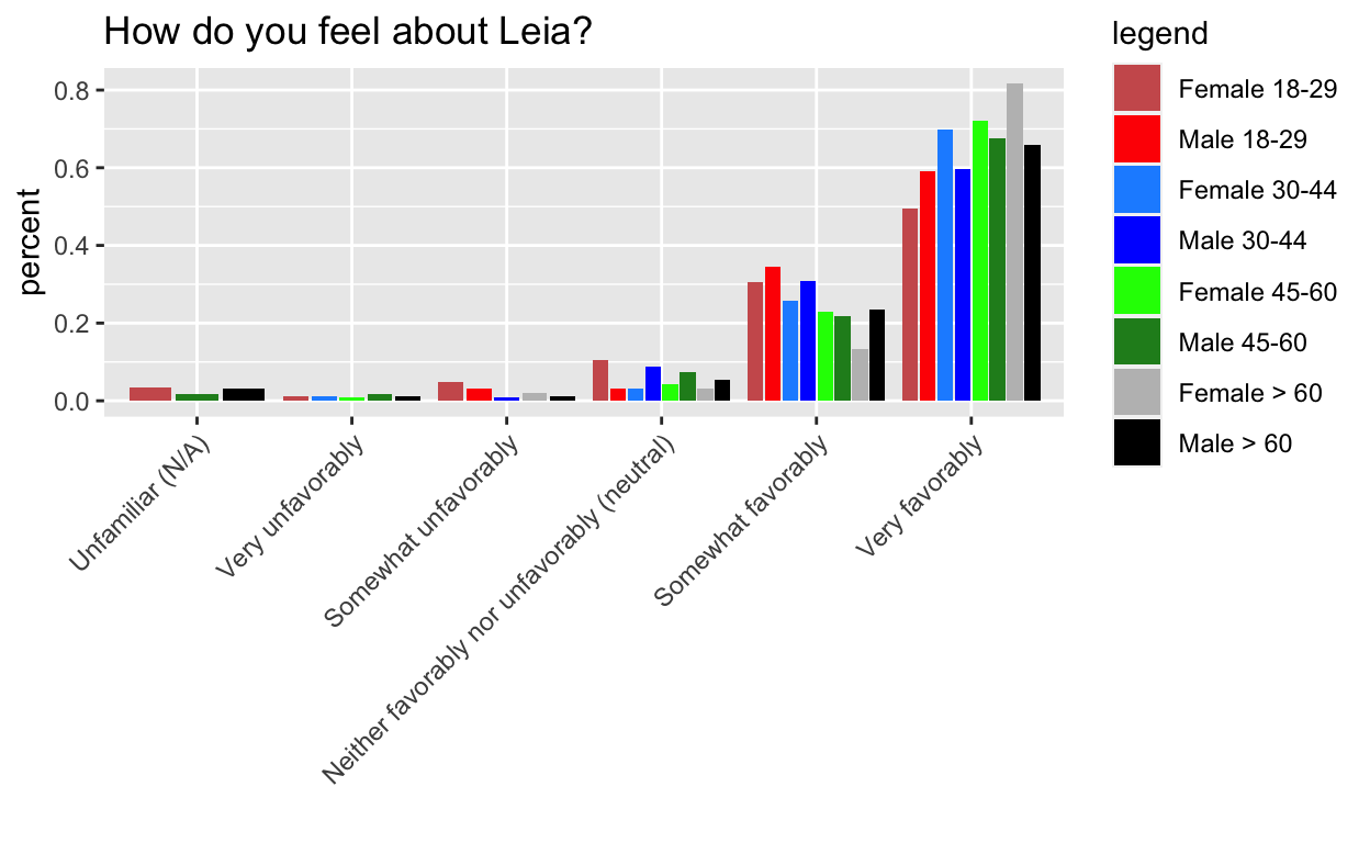
## make colors more informative (light and dark of a color for male and female same age), rearrange levels so easier to compare
Challenges
Side by side instead of stacked (
geom_bardocumentation)Releveling. In haste, I did not do this well. Read this to see why I’m wrong and how I could do better.
Normalizing by the number per category. Letting
stat="count"was a red herring. It would be nice if there was a way to input values to normalize the fill variable by, but instead I ended up manually calculating the percentages and usingstat="identity".- Correct and consistent ordering of colors (to match the legend) Thanks for the pointers @ibddoctor and @hadleywickham!