Setup
Week 3 - Global causes of mortality
RAW DATA
Article
DatSource: ourworldindata.org
Original Graphic
Read and Clean Data
setwd("~/Desktop/tidytuesday/data/2018/2018-04-16")
gm <- read_excel("global_mortality.xlsx")

gm.gathered <- gather(gm, cause, percent, -country, -country_code, -year) ## want a single column for cause of death
gm.gathered$cause <- as.vector(gsub(" \\(\\%\\)", "", gm.gathered$cause)) ## remove (%) in causes of death
Get Colors Ready
I will want the color per cause to be the same across plots.
The colors I use are still not perfectly distinguishable. Any suggestions?
colorOrder <- colorRampPalette(c("red", "orange", "yellow", "green", "blue", "purple"))(length(unique(gm.gathered$cause)))
colorOrderShuffle <- colorOrder[sample(1:length(colorOrder), length(colorOrder))]
## don't want causes close in alphabetical order to be near the same color mainly because of prevalence of
## cancer and cardiovascular diseases


colorMap <- cbind.data.frame(
  colorOrderShuffle,
  unique(gm.gathered$cause)
)
names(colorMap) <- c("color", "cause")
Plot Function
Here is a function to, given a country, plot the causes of death that have the top N highest average percentage and coefficients of variation across the time span.
makePlotTopN <- function(data, Country, N) {
  dataToUse <- subset(data, country == Country) ## get country of interest


  byCause <- group_by(dataToUse, cause) %>% summarise(avgPercent = mean(percent), sdPercent = sd(percent), sdPercentNorm = sd(percent) / avgPercent)
  ## find average and standard deviation of percentages of causes of death across the time frame

  byCauseM <- byCause %>% arrange(desc(avgPercent))
  byCauseSD <- byCause %>% arrange(desc(sdPercentNorm))

  toPlotM <- subset(dataToUse, cause %in% byCauseM$cause[1:N]) ## get top N average
  toPlotSD <- subset(dataToUse, cause %in% byCauseSD$cause[1:N]) ## get top N variability


  ## want colors to be the same across plots
  ## is there an easier way?
  toPlotM$cause <- as.factor(toPlotM$cause)
  toPlotSD$cause <- as.factor(toPlotSD$cause)

  toMergeM <- as.data.frame(toPlotM$cause)
  toMergeSD <- as.data.frame(toPlotSD$cause)
  names(toMergeM) <- names(toMergeSD) <- "cause"

  col1 <- unique(merge(toMergeM, colorMap, by.x = "cause", by.y = "cause"))
  col2 <- unique(merge(toMergeSD, colorMap, by.x = "cause", by.y = "cause"))

  ## plots
  g1 <- ggplot(toPlotM, aes(x = year, y = percent, color = cause)) +
    geom_line(size = 2) +
    ggtitle(paste(Country, ": Top ", N, " Highest Average Cause of Death")) +
    ylab("Percentage of Deaths") +
    xlab("Year") +
    scale_colour_manual(values = as.character(col1$color))

  g2 <- ggplot(toPlotSD, aes(x = year, y = percent, color = cause)) +
    geom_line(size = 2) +
    ggtitle(paste(Country, ": Top ", N, " Highest Coeff of Var Cause of Death")) +
    ylab("Percentage of Deaths") +
    xlab("Year") +
    scale_colour_manual(values = as.character(col2$color))


  grid.arrange(g1, g2, ncol = 2)
}
Following the article to choose sample countries.
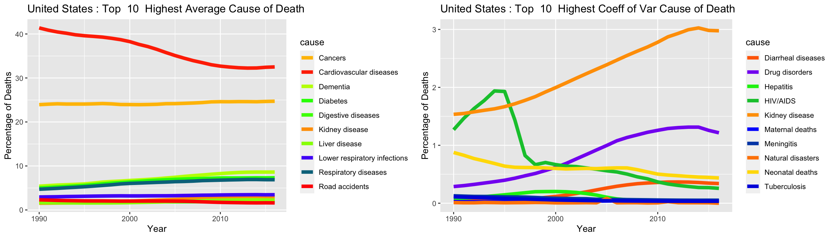
makePlotTopN(gm.gathered, "United States", 10)
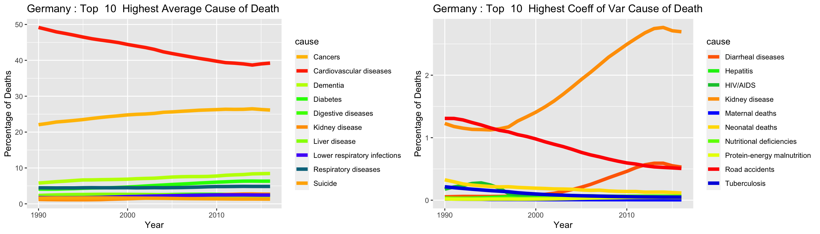
makePlotTopN(gm.gathered, "Germany", 10)
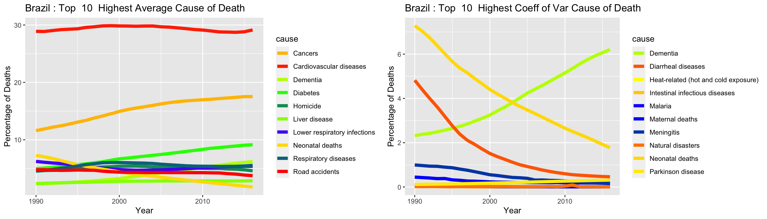
makePlotTopN(gm.gathered, "Brazil", 10)
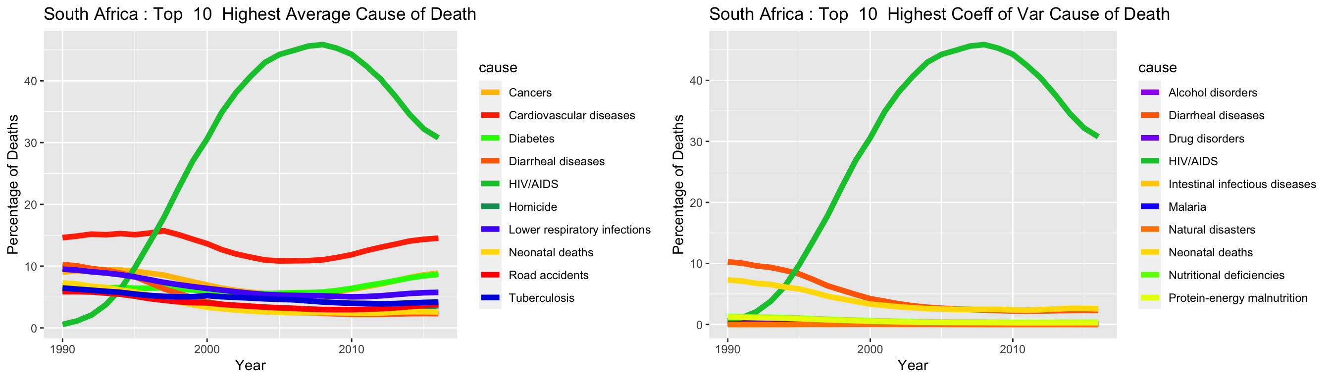
makePlotTopN(gm.gathered, "South Africa", 10)
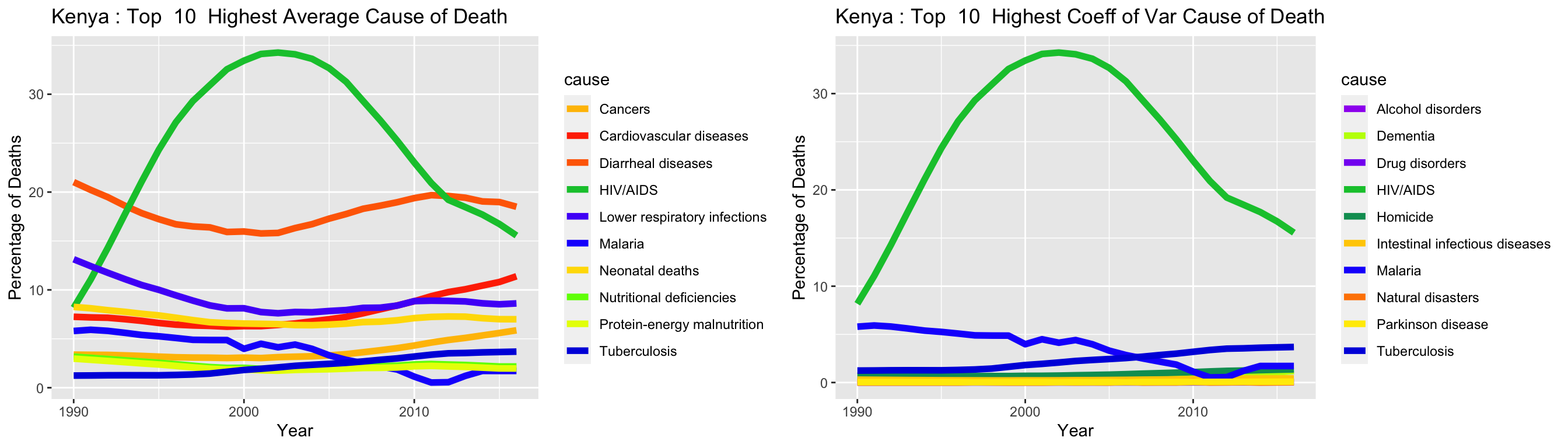
makePlotTopN(gm.gathered, "Kenya", 10)
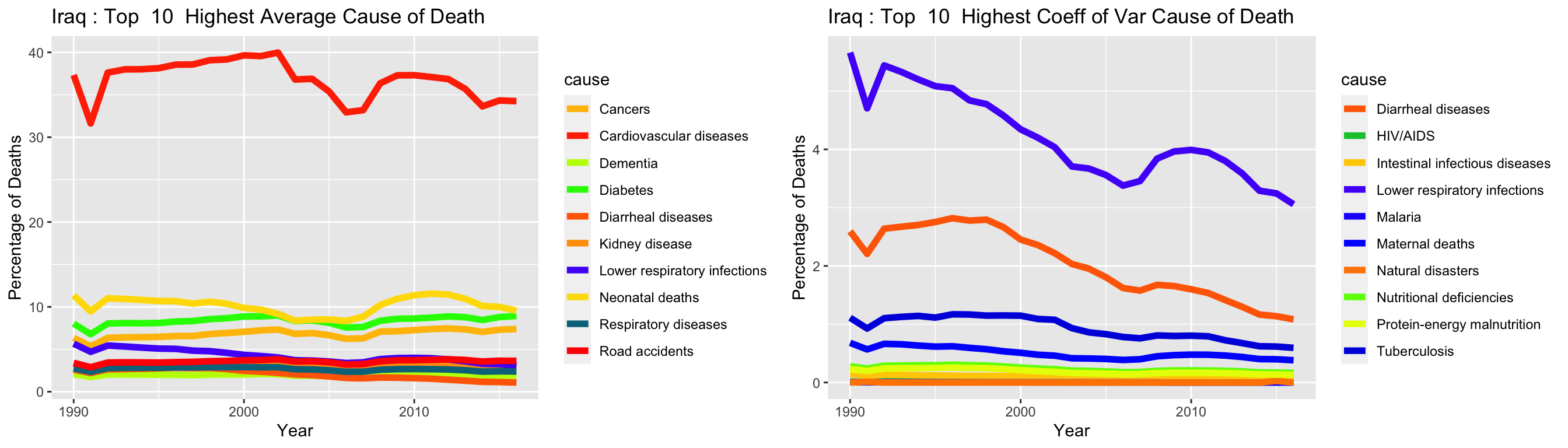
makePlotTopN(gm.gathered, "Iraq", 10)
Note: I wondered how @dpseidel had her Tidy Tuesday plots displayed on Github and discovered this.